~Ribbon Inspiration/Stamp Simply Store – Thank You, Thank You~
January 14th, 2012 by Holly McMillen
Hi Friends!
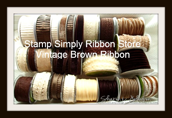
Welcome to this week’s Ribbon Inspiration challenge for Stamp Simply Ribbon Store. If you’ve arrived here from Deb Saaranen’s blog, then you’re in the right spot. If not, I suggest that you start back on Sharon Johnson’s blog to find out how YOU could be eligible to win a luscious ribbon sampler from the picture above.
This week our challenge is to do a More vs. Less set of thank you cards.
Here are my cards:
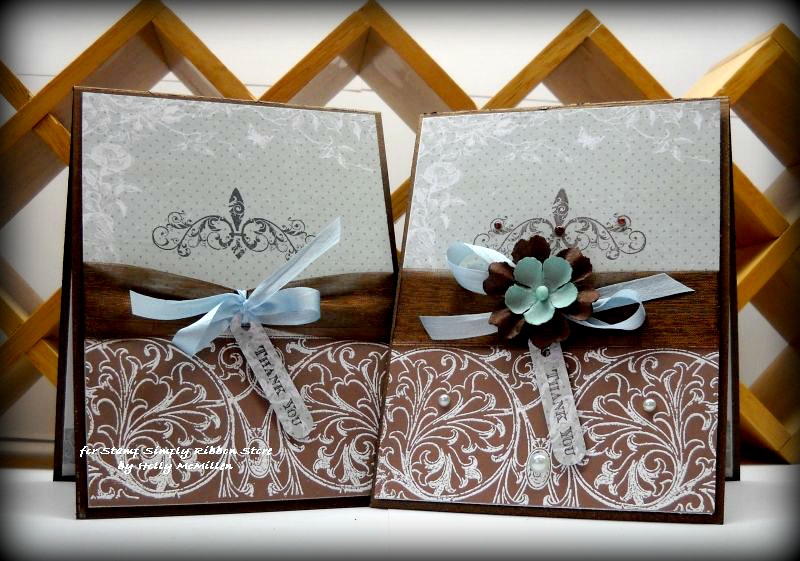
Back when I was part of Splitcoaststampers’ Dirty Dozen, we did a More is More category for the gallery each month and it was one of my favorite challenges. It helped me to transition from gaudily embellished cards to much more simple.
Here is the less card by itself:
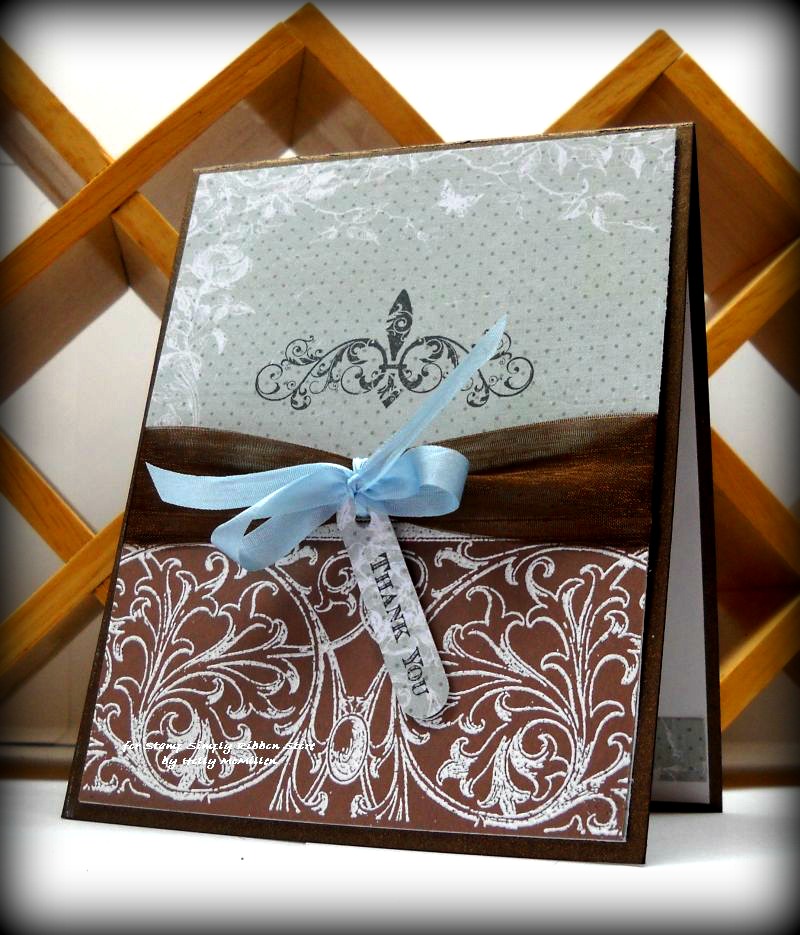
There was a time when I could never have achieved such a simple card and liked it, but I’m actually loving this.
Here it is with MORE:
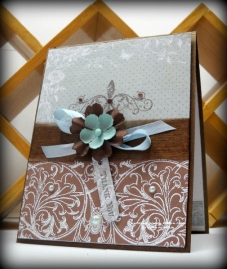
All I did was add a few 1/2 pearls and the flowers and voila.. a bit more POP.
Here are my details:
Stamps: JustRite Stampers’ Scrolled Vine Background and JustRite Stampers’ Fleur De Lis Label Twenty
Papers: Close to Cocoa, The Paper Company metallic bronze, Prima Romantique designer papers
Ink: Versamark, Chocolate Chip
Accessories: 1″ sheer brown ribbon, 1/4″ silk ribbon (light blue), Kaisercraft 1/2 pearls in chocolate and bliss, word window punch, white embossing powder, sticky tape, dimensionals,
**** Items highlighted above are provided by Stamp Simply Ribbon Store ****
~*~*~*~
Now it’s time to send you on over to Michelle Woerner’s blog. I can’t wait to see what she has to share!
Here is a list of all the blogs involved it today’s hop/challenge:
Sharon Johnson – The Stamp Simply Ribbon Store
~*~*~*~
Thanks so much for stopping by! I hope you’ve been inspired :). Join us next week for a new challenge/hop!
Hugs,
Holly


Love the color combo and pretty designs…hope you continue to feel better Holly!
I like the “more” version the most but the CAS is beautiful too! Great colors and dp.
Can’t make up my mind which card I like best as they are both wonderful. Great job, Holly.
More is More and I love More! I also have difficulty doing a ‘simple’ card. I may have to do a bit of practicing thanks to your inspiring card.
Thank you.
More!More!More! Show me more…..just love it
Wonderful cards. I like this color combo–so elegant.
These cards look delicious LOL! Love the chocolate browns and the pearl accents.
Lovely Color Combo! Your cards are both so inspiring!
Gorgeous card. Beautiful and elegant and great color combination and layout
ColleenB.
Your cards are so elegant, Holly! I love the colors and the clean designs!
Love the differences of the two cards. So elegant. Blues & browns are favs too. Barb Shelton
Love the color combo the brown and blues! Great transition from CAS to more elegant.
these are gorgeous. so beautiful and elegant. love them both.
I like this challenge idea! Both cards so pretty. I love the colors you selected and that brown ribbon is so yummy!!
Beautiful! Those pearls make it extra special!
I just love the color combination you used it is really beautiful, thank you for sharing them.
Oh WTG Holly — love your color combo, and your cards are stunning! Love that candy too~
Oh that brown is LUSCIOUS!! wonderful with just that little bit of blue to set it off.
Beautiful! Classy and elegant. Love the blue and chocolate combo
Absolutely love this combo of colors! Both cards are so beautiful!
Your cards are STUNNING. I love the color combination, that stamp, and the yummy ribbon….
absolutely lovely cards!!
They both look dressed up! Thanks for sharing.
I really like the *more* card because when I make a card it seems I am always adding more to look complete. Thanks for sharing.
Love both cards. My favorite is the card with more.
What an awesome look to your 2 cards. Love the browns so the blog candy today is especially appealing. Love using brown with pink, light blue and mint green.
I’m soooo glad someone inventive came up with this color combo, I just love it! It looks up-to-date and still romantic or can be made masculine. Great cards.
Hard to choose which one I like best. Love the color combination.
Love brown and blue together. My favorite is your simple one. You sure do well with clean and simple, even if it isn’t your first love! 🙂
Both are so elegant, I can’t pick which one I like better!
I like both versions! Love your color combo! And cool blg candy, thanks for the chance.
They are both lovely but I especially like the one with flowers 🙂
x
I love blue and brown together, and this was gorgeous. Thanks for sharing.
Loved both cards, and I love your color combination. They are both fabulous!
Lovng the brown with the pop of blue! Gorgeous use of the DPs too 🙂
I’m going have to share this one too… I like it so much;)
So pretty and can be easily changed to fit the need
Both card are beautiful!! I also like the more better but the other is also great!!
I must say, I think both cards are equally pretty.
I’ve always loved that color combination, Holly, and you did a bang-up job on both your cards!
I love the color combination. Thanks so much for sharing.
Both of these are incredibly lovely!
Your work always makes my eyes happy! Your cards are beautiful!
Holly – Totally love your color combination of brown and blue. Thanks for sharing.
Beautiful cards! Love those colours together!!
These are gorgeous! I love the color combo. Your cards are so elegant.
Love both of these cards, Holly! Absolutely love this color combination…always have and forgot about it. Also love that brown ribbon. Thanks, Holly!
These cards are so beautiful. I love the chocolate and blue together! Thanks for the inspiration!
I love both cards, but I especially love the pearls and the small flower. And those colors are absolutely lovely together. It makes the card look more romantic. : )
Stunning cards!!! You did a splendid job here, just beautiful!!
Thanks for sharing
hugs
Donna
Holly,
How can anyone NOT be inspired by such beautiful cards that you have created. They are wonderful, and I love brown and baby blue together, such a warm friendly combo! Thanks for sharing your work and inspiration with us!.
Hugs
Donna
So gorgeous, Holly!! Your cards are so elegant. Thanks so much for sharing your amazing talent!!
Beautiful card Holly – Love the use of brown. That’s something I haven’t done much with. Thanks for the inspiration! [email protected]
http://michelescraftroom.blogspot.com/
Really like the color combination of your wonderful cards,
Love the colors of both cards; Thank you for sharing. (earth tones are my favorite colors)
These are so beautiful, love the amazing stamps and the color combos!
Very elegant Holly.
Lovely cards! I love both versions. Very elegant and rich with that yummy silk ribbon… scrumptious!
DeniseB
What beautiful colors together!! I love seeing how everyone is doing this challenge! Great inspiration, for sure!!
Beautiful cards and color combos. So feminine with browns.
So simply but yet the cards are so beautiful and I love your cards.
Your cards are extremely elegant … tfs your talent.
Beautiful colors, so elegant and classy looking!
These are beautiful! Lovely color combos!
Very pretty colors and design.
Tina
[email protected]
What a lovely elegant card. I just love it!
Love the chocolate brown color you used. Getting in the spirit of the ribbon giveaway!
[…] Holly McMillen […]
I love how your ‘more’ card is still not too fussy and is still mailable!
I love your cards and both look elegant- it took a second look to see most of your additions to the more card.
I love the papers and colours, these are beautiful. Thank you for the inspiration.
Holly, I’m sure You know, that both cards are stunning, but my favourite of these two is ‘less’. It is so elegant and classy that it cannot be named ‘simple’!
Browns and turquoise are my favorite colors. Your cards are beautiful.
It sure is nice when you can love both of the cards you make no matter if one is “more” than the other.
Both cards are beautiful and I love them both!
Both your cards are just beautiful. We often forget that clean simple cards are just as wonderful. TFS
Hi Holly~
I really love both cards. I love that color story…brown is so under-used out there! It is perfect with the light blue.
You are right there isn’t a huge difference in the two cards, and yet both are so amazing. Thank you for showing me how to take a CAS card and dress it up. I know it is the opposite of the challenge…but the lesson I needed.
Thanks for showing me!
He IS Able!
Traci Starkweather
Gorgeous cards and ribbon Holly! Such elegant designs. Hope you are feeling much better!
Both of your cards are aboslutely beautiful. It’s wonderful seeing such elegant CAS cards, as I tend to think my cards need to always be “dressed up”. Thank you for sharing – and, showing how less really can be more.